
Direct Answer
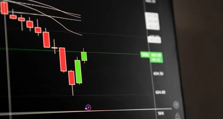
Candlestick anatomy comes down to four prices for one period: open, high, low, and close. The body is the rectangle between the open and close, and the wicks (or shadows) are the thin lines marking the high and low reached during the bar. Body size and wick length describe who controlled the bar, buyers, sellers, or neither, before any named pattern is applied, and direction is read from where the close sits relative to the open rather than from color alone, since color conventions vary by platform.
Candlestick Anatomy: How to Read a Candle
Every candlestick plots four prices for one period: open, high, low, and close. The body is the rectangle between the open and close; the wicks (or shadows) are the thin lines showing the high and low reached during the bar. Body size and wick length describe who controlled the bar, buyers, sellers, or neither, before any named pattern is applied.
Key Takeaways
- Open, high, low, and close are the only four inputs to a candlestick, every pattern on this site is built from those same four numbers.
- The body shows where the bar settled (open to close); the wicks show the extremes it touched along the way (high and low) even if price didn't stay there.
- Fill or color marks direction: a bullish candle closed above its open, a bearish candle closed below its open, and it's never signaled by color alone, since color conventions vary by platform.
- A long body with short wicks means one side controlled the bar from open to close; long wicks with a small body mean both sides pushed price around but neither held the advantage by the close.
- A "candle" is just whatever period the chart is set to, the same body/wick geometry applies on a 1-minute chart and a monthly chart, but the significance of what it shows scales with the timeframe.
The Four Prices Behind Every Candle
A candlestick is a compact way to show four numbers for one trading period: the open (first trade), the high (highest trade), the low (lowest trade), and the close (last trade). Every other candlestick concept, body, wick, pattern, is derived from these four values and nothing else.
| Price | What it marks | Where it shows on the candle |
|---|---|---|
| Open | First trade of the period | Top or bottom edge of the body |
| Close | Last trade of the period | The other edge of the body |
| High | Highest trade of the period | Top of the upper wick |
| Low | Lowest trade of the period | Bottom of the lower wick |
Body vs. Wick: What Each One Shows
The body is the thick rectangle between the open and close. Whichever price is higher forms the top of the body; whichever is lower forms the bottom. Body size shows conviction: a long body means price moved a long way from open to close without much of a fight, while a short or near-zero body means the close ended up close to where the bar started, regardless of what happened in between.
The wicks (also called shadows) are the thin lines extending above and below the body to the high and low. They show the full range the bar reached, including territory that was later given back. A candle with almost no wicks means price moved in essentially one direction all bar; a candle with long wicks on one or both sides means price was pushed to an extreme and then pulled back before the close, a struggle the body alone doesn't show.
Bullish vs. Bearish: What the Fill Means
A candle is bullish (up) when the close is above the open, and bearish (down) when the close is below the open. Most charting platforms mark this with fill or color, commonly a solid or green body for bullish, a hollow or red body for bearish, but the exact colors are a platform convention, not a rule. This site's chart illustrations fill bullish bodies solid and leave bearish bodies hollow so the direction reads correctly even without color.
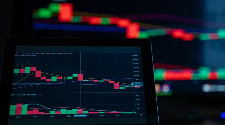
Fill only encodes one thing: which of open or close was higher. It says nothing about how the bar got there, how much conviction was behind the move, or what the bar means in context, that's what body size, wick length, and the surrounding trend are for.
What a Candle's Shape Says About the Auction
A single trading period is a continuous auction between buyers and sellers. Reading a candle's shape is really reading how that auction went:
- Long body, small wicks, one side controlled the bar almost the entire period. A long bullish body with little upper wick means buyers pushed price up and held it near the high into the close.
- Small body, long wick on one side, one side pushed price to an extreme, but the other side fought back and pulled the close away from that extreme by the end of the bar. A long lower wick with a small body near the top (the hammer shape) shows sellers pushed price down, then buyers reclaimed most of that ground before the close.
- Small body, wicks on both sides, neither side held control; price was pushed both up and down but settled close to where it opened. This is the doji and spinning top shape: indecision, not a resolved contest.
- No wicks at all (a marubozu), one side controlled the bar from the very first trade to the very last, with no meaningful pushback in either direction.
None of these shapes are a forecast by themselves. A single candle only describes what already happened during that one period, what it implies about what happens next depends on the trend it appears in, nearby support and resistance, and whether the following bars confirm the read. That's covered in more depth in why candlestick patterns need context and confirmation.
A Candle in Context
The chart below uses the same body/wick geometry described above, built into a real pattern (a marubozu, no wicks, a single side in control the whole bar). Toggle between the confirmation and failure paths to see that even a decisive-looking candle doesn't determine what happens next by itself.
How Timeframe Changes a Candle
A "candle" isn't a fixed unit of time, it's whatever period the chart is set to. A 1-minute chart's candle aggregates one minute of trading into open, high, low, and close; a daily chart's candle aggregates an entire session; a weekly candle aggregates five daily sessions. The geometry and the interpretive concepts (body, wick, bullish/bearish) mean the same thing at every timeframe, but the amount of trading activity, and the number of participants, condensed into a single candle grows with the timeframe.
Practically. That means a pattern's significance scales with its timeframe. A daily candle forming at a well-established support level generally carries more weight than the same-shaped candle on a 1-minute chart in the middle of an ordinary range, simply because far more trading decisions are compressed into the daily bar. Neither is "wrong", they're just describing auctions of very different size and duration.
Four Numbers, and Everything Between Them Is Missing
A candle contains an open, a high, a low and a close, and nothing else. The order in which those prices occurred is not recorded, so a session that opened, collapsed to its low, and rallied to close near the high produces the identical candle to one that rallied first and sold off to the same close. Every named pattern on any chart is built from these four numbers, which means every pattern inherits that blind spot.
Which is why the body and wicks are read as a description of an outcome rather than a narrative. The body says where the bar settled between its open and close; the wicks say what extremes were touched and not held. Combining them tells you which side finished in control, not how the session got there.
Colour is the least reliable part. A bullish candle is one that closed above its open, and that fact should be read from the body rather than from a fill convention that varies between platforms and can be changed by a user setting.
And the timeframe decides what a candle even is. The same price history rendered as hourly bars and as daily bars produces entirely different candles and entirely different patterns, so a shape is a property of the interval you chose as much as of the market.
Candlestick Anatomy FAQs
What are the four prices on a candlestick?
Open, high, low, and close. Open and close set the top and bottom of the body (whichever is higher becomes the top); high and low set the top and bottom of the wicks above and below the body.
What's the difference between a candle's body and its wick?
The body is the rectangle between the open and close, it shows where the bar settled. The wicks (also called shadows) are the thin lines above and below the body showing the highest and lowest prices reached during the bar, even if price didn't stay there.
Why are some candles filled and some hollow?
It's a coloring or fill convention showing direction: a bullish (up) candle closed above where it opened, a bearish (down) candle closed below where it opened. The specific colors vary by charting platform, so most readers also rely on fill (solid vs. hollow) rather than color alone.
Does a candle represent a fixed amount of time?
No. A candle represents whatever period the chart is set to, one minute, one hour, one day, one week. The same pattern of open/high/low/close geometry means the same thing on any timeframe, but a daily candle aggregates far more trading activity than a 1-minute candle.
Do I need to memorize every candlestick pattern to read a chart?
No. Understanding what open, high, low, close, body, and wick represent lets you read any individual candle. Named patterns are just recurring shapes and shape combinations built from those same four prices.
Do all platforms use the same colour convention?
No, and there are two distinct conventions in circulation. One colours the candle by close against open, which is the traditional filled and hollow distinction. The other colours by close against the previous close, which is what hollow candlestick charts use for their colour dimension. Two charts of identical data can therefore show different colours on many bars.
How does tick size affect what a candle can look like?
It sets the granularity of every measurement. In an instrument where the tick is a large fraction of the price, bodies and shadows can only take a few possible lengths, so doji bodies and zero-length shadows occur frequently for mechanical reasons. Pattern definitions written with finely quoted instruments in mind produce very different results on coarsely quoted ones.
Is the close on a candle the last trade of the session?
In most equity markets it is the closing auction price rather than the final continuous trade, and those can differ. Since the close determines the body top or bottom and therefore the colour of the candle, a substantial share of what a candlestick chart shows is determined by an auction mechanism rather than by continuous trading during the session.
Do candles mean the same thing on a Renko or constant-volume chart?
The four prices are still plotted and they no longer describe a period of time. A Renko brick open and close are set by the construction rules rather than by trading, and a constant-volume bar covers however long it took a fixed quantity to trade. Candlestick interpretation assumes each bar summarises a defined period of market activity, which those charts do not provide.
References
- CMT Association: Technical Analysis Body of Knowledge and Research
- Steve Nison, Japanese Candlestick Charting Techniques (1991), the book credited with popularizing Japanese candlestick analysis in Western markets.
- SEC Investor.gov: Introduction to Investing