

Direct Answer
A daily chart plots one bar per trading day and is used mainly for entry timing and short-term trend reads, while a weekly chart compresses five trading days into a single bar to reveal the longer-term trend beneath daily noise. The two can disagree: a security may look like it's in a daily downtrend while its weekly trend is still up, or the reverse, which is exactly why multi-timeframe traders check both before acting.
Key Takeaways
- A daily chart bar represents one trading session's open, high, low, and close.
- A weekly chart bar aggregates five trading days into a single open, high, low, and close.
- Swing traders commonly use daily charts for entry and exit timing.
- Weekly charts are commonly used to establish the longer-term trend context.
- Weekly charts filter out day-to-day noise that can obscure the broader trend on a daily chart.
- The daily and weekly trend can point in different directions at the same time.
- Neither timeframe alone tells the full story, that's the premise behind multi-timeframe analysis.
How Daily and Weekly Bars Are Built
A daily bar or candle records a single session: the price at the open, the highest and lowest prices reached during the day, and the price at the close. Stack enough of these side by side and you get a daily chart, the most common timeframe for actively watching a position and deciding when to buy or sell.
A weekly bar is built the same way but over a longer window: it takes the open on the first trading day of the week, the high and low across all five sessions, and the close on the last trading day of the week, and folds that into one bar. Five daily bars become one weekly bar. Because each weekly bar absorbs a full week of price movement, small reversals and single-day spikes that stand out on a daily chart often disappear entirely on a weekly chart, leaving only the broader directional move visible.
Why Traders Use Both Together
The two timeframes serve different jobs. A weekly chart is typically consulted first, to answer a simple question: is the longer-term trend up, down, or sideways? That read sets the context for what kind of trades are worth considering at all, many trend-following approaches favor looking for buy setups only when the weekly trend is up, or sell setups only when it's down. The daily chart is then used to time the specific entry within that context: waiting for a pullback, a breakout, or a particular candlestick pattern to form on the daily bars before acting.
Consider a stock whose weekly chart shows a clear series of higher highs and higher lows over several months, a weekly uptrend. Within that same stretch, the daily chart might show a choppy two-week pullback that looks, on its own, like a short-term downtrend. A trader looking only at the daily chart might read that pullback as a reason to avoid or short the stock. A trader who has also checked the weekly chart may instead read the same pullback as a temporary dip inside a still-intact longer-term uptrend, a very different conclusion drawn from the same daily price action, simply because the weekly context was added.
Limitations and Common Mistakes
- Trading the daily chart in isolation. A pattern that looks decisive on a daily chart can be a small ripple inside a much larger weekly move in the opposite direction.
- Treating the weekly chart as precise timing. Weekly bars are too coarse for entry and exit timing, they update once a week, which is far too slow for most swing-trading decisions.
- Ignoring conflict between timeframes. When the daily and weekly trends disagree, that's information, not noise, it usually means lower conviction or a signal to wait for alignment rather than a reason to pick whichever chart supports the trade you already want to make.
- Assuming more timeframes always means more clarity. Daily and weekly are a common starting pair, but stacking many timeframes at once can just as easily produce conflicting signals and analysis paralysis.
- Forgetting that neither timeframe is "more true." Daily and weekly charts are two views of the same underlying price data, not two competing sources of truth.
The Weekly Bar You Are Looking At Is Not Finished
A practical detail gets skipped in most descriptions of this pairing: for four days out of five, the current weekly bar is incomplete. A weekly candle that looks decisively bullish on Tuesday can close as a bearish reversal on Friday, because it is still being built from the daily bars that have not printed yet. Reading a live weekly bar as though it were settled is reading a partial aggregate as a conclusion.
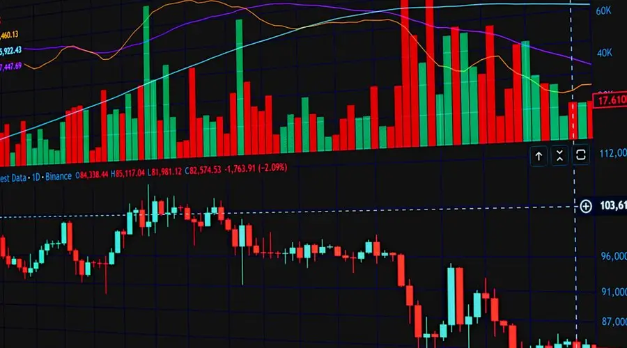
That is also why the weekly chart is structurally unsuited to timing. It updates once a week, which is far too slow for swing-trading entries and exits, and no amount of attention makes it faster. Its job is establishing the trend the daily chart operates inside, and asking it for a precise entry is asking for information the resolution does not contain.
The mirror error is trading the daily chart alone. A decisive-looking daily pattern can be one bar of chop inside a much larger weekly move in the other direction, and nothing on the daily chart reveals that. When the two disagree, the honest reading is lower conviction, not a licence to pick the chart that supports the trade you already wanted.
Resist the urge to fix ambiguity by adding intervals. Daily and weekly are a common pair because two views are usually enough to establish context and timing. Stacking four or five produces more disagreements to resolve, not more clarity.
Frequently Asked Questions
Should I use daily or weekly charts for swing trading?
Most swing traders use both together rather than picking one: the weekly chart establishes the broader trend and key levels, while the daily chart is used to time the actual entry and exit within that context.
Can a stock be in a daily downtrend and a weekly uptrend at the same time?
Yes. A short-term daily downtrend can occur inside a longer-term weekly uptrend, and vice versa, because each timeframe aggregates price action differently and can show a different structure at the same moment.
How many trading days make up one weekly candle?
A weekly chart aggregates five trading days (a standard Monday-through-Friday trading week) into a single bar or candle, using the week's open, high, low, and close.
Why do weekly charts filter out noise that daily charts don't?
Because each weekly bar compresses five days of price action into one data point, small intraday and day-to-day fluctuations that would show up as separate bars on a daily chart are absorbed into the week's aggregate open, high, low, and close.
Where do a weekly bar high and low come from?
From the extremes across the daily bars inside the week, so the weekly high can have occurred on any session and the weekly low on any other. The bar records the four values without preserving when each happened. A weekly candle showing a long lower wick could describe a Monday collapse that recovered all week or a Friday flush that partially bounced, and the chart cannot distinguish them.
Is a 10-period weekly average equivalent to a 50-period daily average?
Approximately, since a week is about five sessions, and not identically. The weekly version averages ten weekly closes, which are five specific prices out of fifty. The daily version averages all fifty. They track each other closely and diverge around sharp moves, particularly when a large intra-week swing does not show up in the weekly closes. Treating them as the same line will eventually mislead.
Is a weekly RSI the average of the daily RSIs?
No, and the difference matters. A weekly RSI is computed from weekly price changes, so a week that fell hard midweek and closed unchanged contributes nothing to it, while the daily RSI registered the whole round trip. The two are computed on different inputs, not on the same input at different resolutions. Neither can be derived from the other.
Can the daily chart show structure the weekly chart cannot?
Routinely. Any pattern that completes within a few sessions is invisible once the data is aggregated into weekly bars, because the intra-week sequence is discarded. A three-day reversal formation becomes part of one candle. This is the intended tradeoff of the higher timeframe and it means the weekly chart is not a cleaner version of the daily one, it is a different and less detailed record.
How much history does a long weekly lookback actually cover?
A 200-period weekly average spans nearly four years of trading, which is a very different claim from the roughly ten months a 200-day average covers. Carrying a familiar number across timeframes without translating it into calendar time is one of the easier ways to end up analysing a horizon nobody intended. The period count is the same; the question it answers is not.
References
- CMT Association: Chartered Market Technician body of knowledge, covering multi-timeframe technical analysis methodology.
Disclaimer
This page is for general education only and is not personalized investment, financial, tax, or legal advice. Timeframe analysis does not guarantee any trading outcome. Do your own research and consider consulting a licensed professional before making investment decisions.