
Direct Answer
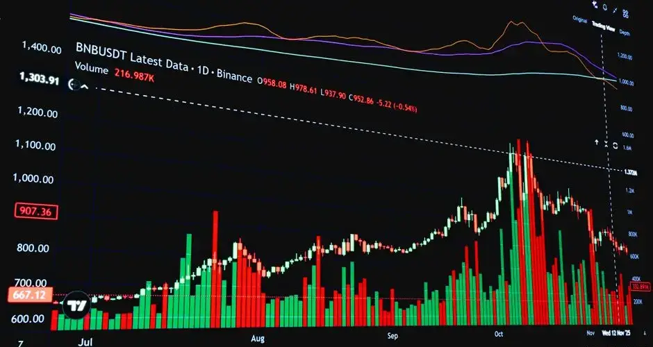
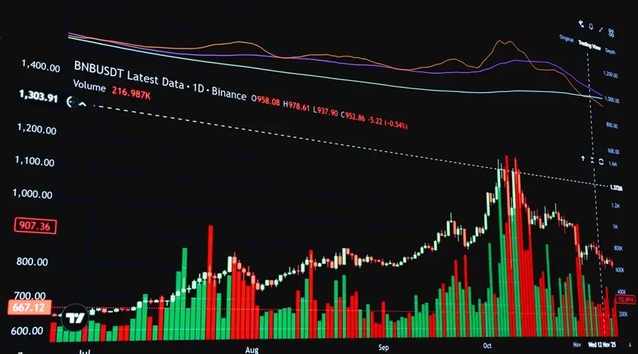
Volume-weighted charts are price charts that build traded volume directly into the appearance of each bar or candle, instead of relegating volume to a separate subplot below price. The three most common forms are volume bars (a height-scaled bar under each price period), volume-shaded candles (a color gradient applied to ordinary candles based on relative volume), and Equivolume charts (where each box's width, not just its height, is scaled to that period's volume). Each approach lets a trader see participation and price action in the same glance rather than cross-referencing two charts.
Key Takeaways
- Volume-weighted charts encode volume into the visual structure of price bars rather than as a separate indicator pane.
- Volume bars scale a bar's height to the period's traded volume, typically colored by whether the period closed up or down.
- Volume-shaded candles keep standard candle shape but apply a color intensity or gradient tied to relative volume.
- Equivolume charts, developed by Richard W. Arms Jr., scale each box's width to volume and its height to the price range, the x-axis is no longer evenly spaced by time.
- Wide, tall Equivolume boxes flag high-volume, wide-range periods; narrow boxes flag quiet, low-participation periods.
- Volume-weighted charts are a category of visualization techniques, not one standardized formula, scaling and color thresholds vary by charting platform.
- They differ from a volume profile, which aggregates volume by price level rather than by time period.
- None of these formats predict direction on their own, they surface participation, which traders interpret alongside trend and price-action context.
How Volume Gets Built Into the Chart
A standard candlestick or bar chart shows only price, open, high, low, close, for each period, with volume (if shown at all) drawn as a separate bar chart underneath. Volume-weighted charts instead attach the volume reading to the price bar itself, using one of a few common mechanisms:
- Volume bars. The simplest form: a vertical bar beneath each price period, with height proportional to that period's traded volume, most often colored green/red (or the platform's up/down colors) to match the period's close direction relative to its open.
- Volume-shaded (volume-weighted) candles. The candlestick body itself is shaded on a gradient, for example, a faint fill for low-volume periods and a saturated fill for high-volume periods, so volume is visible without a separate pane at all.
- Equivolume charts. Each period is drawn as a box rather than a candle. Box height still reflects the high-to-low price range, but box width is scaled to that period's volume relative to the volume range across the visible chart:
widthi = (Volumei / Volumemax) × MaxBoxWidth
Because width now carries volume information, Equivolume charts abandon even time spacing on the x-axis, a high-volume day is visually wider than a low-volume day, so the horizontal axis represents cumulative volume-scaled width rather than a strict calendar.
Worked Example (Hypothetical)
Consider a hypothetical five-day stretch used only to illustrate the Equivolume scaling mechanism, none of these prices or volumes describe a real security:
- Day 1: range $48-$50, volume 2.0 million shares
- Day 2: range $49-$53, volume 6.0 million shares
- Day 3: range $52-$54, volume 3.0 million shares
- Day 4: range $53-$58, volume 9.0 million shares (the period's highest volume)
- Day 5: range $56-$57, volume 1.5 million shares
With Day 4's 9.0 million shares set as Volumemax, Day 1's relative width would be 2.0 / 9.0 ≈ 22% of the maximum box width, Day 2's width ≈ 67%, Day 3's width ≈ 33%, Day 4's width = 100%, and Day 5's width ≈ 17%. Plotted side by side, Day 4 appears as a wide, tall box, a large price range on heavy participation, while Day 5 appears as a narrow, short box, visually signaling a quiet, low-conviction period even though its price range alone might not stand out on a normal candlestick chart.
Why Volume-Weighted Charts Matter
Price range alone doesn't say whether a move was broadly participated in or driven by comparatively thin trading. A wide-range candle on unremarkable volume and a wide-range candle on unusually heavy volume can look identical on a plain candlestick chart, even though many traders would weigh them very differently. Folding volume into the bar's shape or color removes the need to glance back and forth between the price pane and a volume subplot, making it easier to spot, at a glance, which price moves in a chart's history were accompanied by heavier-than-usual participation and which were not.
This is particularly relevant around breakouts, breakdowns, and reversal candidates, where traders often want to see immediately whether the move that triggered their attention came with above-average volume or looked comparatively empty.
Limitations and Common Mistakes
- No single standard. "Volume-weighted chart" covers several distinct techniques (volume bars, volume-shaded candles, Equivolume) with different mechanics, confirm which one a given platform or source means before comparing charts.
- Equivolume distorts the time axis. Because box width reflects volume rather than a fixed time interval, the x-axis is no longer evenly spaced by calendar time, which can make it harder to line up an Equivolume chart against a standard time-based chart or indicator.
- Color/shading thresholds are platform-specific and somewhat arbitrary. What counts as "high" volume on a shaded-candle gradient depends on the lookback window and scaling the platform chooses, not a fixed rule.
- Volume without context can mislead. A volume reading only matters relative to that instrument's typical volume, comparing an absolute bar height across different securities or timeframes is not meaningful on its own.
- Not a substitute for order-flow or tape data. Volume-weighted charts show total volume per period; they don't show buy/sell imbalance, order size, or intraday sequencing the way time-and-sales or order-flow tools do.
- Limited platform support. Equivolume and volume-shaded candles are less universally available than standard candlesticks or a plain volume subplot, so not every charting tool offers them.
Three Different Charts Under One Name
Volume-weighted chart is a category label rather than a format. Volume bars scale height under the price panel, volume-shaded candles keep the usual shape and vary colour intensity, and Equivolume changes box width. Those are three different mechanics producing three different reading experiences, so the first step with any such chart is establishing which one is actually on screen before comparing it to anything.
Equivolume carries the largest structural consequence. Because width encodes volume, the horizontal axis stops being evenly spaced in time, which means the chart cannot be lined up bar for bar against a standard time-based chart or against most indicators. A wide box is a busy period, not a long one, and reading it as duration inverts the whole point.
The shaded-candle approach has the opposite problem: it looks entirely familiar and its thresholds are invisible. What counts as high volume in a gradient depends on the lookback and scaling the platform chose, so the same session can render as emphatic on one chart and unremarkable on another without either being wrong.
Underneath every variant, volume only means something relative to what is normal for that instrument. A visually dramatic bar on a thinly traded name can represent very ordinary participation, and encoding the number into the price bar makes it more prominent without making it more comparable.
Frequently Asked Questions
What are volume-weighted charts?
Volume-weighted charts are price charts that build traded volume directly into the visual structure of each bar or candle, rather than showing volume as a separate subplot underneath price. Common forms include volume bars, candles shaded or colored by relative volume, and Equivolume charts where each candle's width represents its volume.
What is an Equivolume chart?
An Equivolume chart, developed by Richard W. Arms Jr., replaces evenly spaced time-based candles with boxes whose height reflects the period's price range and whose width is scaled to that period's traded volume. Wide, tall boxes mark high-volume, wide-range periods, while narrow boxes mark low-volume, quiet periods.
How do volume-weighted charts differ from a volume profile?
Volume-weighted charts (volume bars, shaded candles, Equivolume) attach volume to each time period along the x-axis. A volume profile instead aggregates volume horizontally by price level, showing how much total volume traded at each price regardless of when it occurred. The two answer different questions: when volume happened versus where it happened.
Do volume-weighted charts predict price direction?
No. Volume-weighted charts make it easier to see whether a price move was accompanied by high or low participation, but volume alone does not signal which direction price will go next. Traders typically read volume-weighted charts alongside trend, support/resistance, and other price-action context rather than as a standalone directional signal.
Is there a single standard formula for volume-weighted charts?
No. Volume-weighted charts are a category of visualization techniques rather than one calculation. Volume bars simply scale bar height to volume, while Equivolume scales candle width to volume relative to the highest-volume period in view, and volume-shaded candles apply a color gradient based on relative volume, the exact scaling and color thresholds vary by charting platform.
What is a constant-volume bar chart?
A chart where each bar completes after a fixed quantity of volume has traded, rather than after a fixed period. It is a different construction from the width-encoded charts that show volume as box width: here volume determines when a bar ends, not how wide it is drawn. Bars are equal width and unequal duration, which is the opposite arrangement to a time chart.
Which volume figure should a volume-weighted chart use?
Whichever it uses has to be stated, because the answer changes the chart. Equity volume is fragmented across many venues, so a single-exchange feed and a consolidated tape produce different figures for the same period. Crypto is more fragmented still, with no consolidated tape at all. Since the entire construction is driven by the volume series, the source is not a minor detail.
Do moving averages behave differently on a constant-volume chart?
Yes. A twenty-period average covers twenty bars, and on a constant-volume chart those bars span a variable amount of time depending on how active the market was. In a busy session the average covers a short window; in a quiet one the same twenty bars stretch across much longer. The average adapts to activity rather than to the clock, which is either the point or a problem depending on the intent.
How do volume-weighted charts handle thin overnight sessions?
A constant-volume chart may take the entire overnight session to complete a single bar, so hours of trading collapse into one candle. A width-encoded chart draws those periods as very narrow boxes that are hard to read. Either way the low-activity part of the day occupies little chart space, which is the intended behaviour and also means overnight moves are easy to overlook.
References
Disclaimer
This page is for educational purposes only and does not constitute investment, financial, or trading advice. Chart types like volume bars, volume-shaded candles, and Equivolume boxes reflect historical price and volume behavior and do not guarantee future results; the worked example on this page uses illustrative, hypothetical figures, not live or historical market data. Swoopr Investment is not a licensed investment advisor; consult a qualified professional before making investment decisions.