
Direct Answer
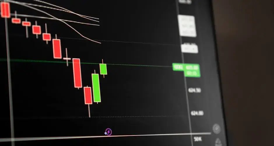
A hollow candlestick chart is a candlestick variant where the body's fill state, hollow (outline only) versus solid-filled, rather than necessarily its color, is the primary signal of the period's character. A common convention draws the body hollow when the period's close is above its open, and filled or solid when the close is below its open.
Key Takeaways
- A hollow candlestick chart uses whether the body is hollow (outline only) or filled/solid, not necessarily its color, as the primary signal of a period's character.
- A common convention: hollow when the close is above the open, filled when the close is below the open.
- Color is sometimes layered on top of the hollow/filled body as a second, independent dimension, commonly comparing the close to the prior period's close.
- Wicks (highs and lows) are constructed exactly as on a standard candlestick, only the body's fill and color conventions change.
- Named candlestick patterns are defined by the open/high/low/close relationship, so they read the same way on a hollow candlestick chart as on any other candlestick chart.
What Is a Hollow Candlestick Chart?
A hollow candlestick chart is a candlestick variant where the body's fill state, hollow (outline only) versus solid-filled, rather than necessarily its color, is the primary signal of the period's character. A common convention draws the body hollow when the period's close is above its open, and filled or solid when the close is below its open. Color is sometimes layered on top as a second dimension, for example comparing the current close to the prior period's close, to convey information beyond what a standard two-color candlestick shows.
How a Hollow Candlestick Is Built
Every candlestick, hollow or otherwise, is drawn from the same four inputs for a given period: the open, high, low, and close. The high and low set the top and bottom of the wick (or shadow), the thin line extending above and below the body. The open and close set the top and bottom of the body itself.
On a standard two-color candlestick, that body is filled solid in one of two colors, commonly green versus red, or white versus black, depending on whether the close is above or below the open. A hollow candlestick chart uses a different visual channel for that same comparison: instead of (or alongside) a color change, the body's fill state does the signaling. Under the common convention described above, a period that closes above its open draws an unfilled, outline-only body, while a period that closes below its open draws a solid, filled-in body.
Because fill state and color are two separate visual channels, a charting platform can use them independently. A platform that layers color on top of the hollow/filled convention might, for instance, color a hollow body one way when the close is also above the prior period's close, and a different way when it isn't, producing up to four visually distinct body types (hollow-and-one-color, hollow-and-another-color, filled-and-one-color, filled-and-another-color) from the same open/close data. This is a charting-platform convention rather than a single universal standard, so the exact color rule layered on top of the hollow/filled body can vary by platform.
How It Looks: A Worked Example
Hypothetical example, for education only.
Consider four consecutive hypothetical daily candles for a stock, using the common convention (hollow when close is above open, filled when close is below open):

| Day | Open | Close | Body fill | What it shows |
|---|---|---|---|---|
| 1 | $50.00 | $51.20 | Hollow | Close above open, period closed up |
| 2 | $51.20 | $50.60 | Filled | Close below open, period closed down |
| 3 | $50.60 | $52.10 | Hollow | Close above open, period closed up |
| 4 | $52.10 | $51.90 | Filled | Close below open, period closed down |
Reading left to right, the sequence hollow → filled → hollow → filled tells a chart reader, at a glance, which of those four periods closed above their own open and which closed below, the same information a standard candlestick would show with a color change, here shown with the body's fill state instead. If a platform layers color on top, Day 3 (close $52.10, above Day 2's close of $50.60) might additionally be shown in one color, and Day 4 (close $51.90, below Day 3's close of $52.10) in another, despite Day 4 being a filled body just like Day 2, the added color layer would visually distinguish it from Day 2 based on the prior-close comparison rather than the open/close comparison alone.
How Traders Use It
A hollow candlestick chart conveys the same open/high/low/close information as any other candlestick chart, it does not add new price data, only a different visual encoding of the existing open-versus-close comparison. Some traders find a hollow-versus-filled distinction easier to scan quickly across a dense chart than a color change, particularly at small sizes or in situations where color alone is harder to distinguish. When a platform layers color on top of the fill convention, the added color dimension can let a trader read two comparisons at once, open-versus-close (fill state) and close-versus-prior-close (color), without needing a second indicator or chart.
Because named candlestick patterns (for example, a doji) are defined by the relationship between the open, high, low, and close rather than by fill state or color, pattern recognition itself is unaffected by which candlestick style a chart uses. Choosing a hollow candlestick chart is a chart-reading preference, not a change in what a given price bar means.
Limitations and Common Mistakes
- Assuming one fixed color-to-fill mapping. The hollow-versus-filled convention itself is common, but the additional color layer some platforms add on top is a platform-specific choice, not a single universal standard, check what a given chart's color legend actually means before relying on it.
- Confusing fill state with candlestick pattern names. A hollow or filled body describes the open/close relationship for one period; patterns like a doji, engulfing candle, or hammer are separate, multi-part definitions that still apply the same way regardless of fill or color convention.
- Treating fill state as a trading signal by itself. Whether a single period closed above or below its own open says little on its own about broader trend or momentum, it's raw price-structure information, not a buy or sell signal.
- No added price information. Switching to a hollow candlestick chart changes how the same open/high/low/close data is displayed; it does not provide any additional data such as volume, liquidity, or fundamentals.
Check the Legend Before You Trust the Colours
The hollow-versus-filled convention is fairly consistent: hollow when the close is above the open, filled when it is below. The colour layer some platforms add on top is not standardised at all. It commonly compares the close to the prior period close, which is a genuinely different comparison from the one the fill encodes, and platforms differ in whether they add it, how they map it and whether the user has changed the default. Reading a red hollow candle without knowing what red means on that chart is guessing.
Once the legend is understood, the value of the variant is that it shows two relationships in one bar: this period internal direction and its position relative to the last one. That is more information than a standard two-colour candle carries, and it is the only reason to switch.
What it is not is more price data. The same open, high, low and close produce the bar either way, so switching chart styles changes the presentation and adds nothing to the underlying record. Any pattern you could identify before, a doji, an engulfing bar, a hammer, is defined by those four values and reads identically here.
And a single period fill state is not a signal. Whether one bar closed above or below its own open is raw structure, informative in sequence and close to meaningless alone, which is why the patterns are built from multiple bars in the first place.
Hollow Candlestick Chart FAQs
What is a hollow candlestick chart?
A hollow candlestick chart is a candlestick variant where whether the body is hollow (outline only) or filled/solid, not necessarily its color, is the primary signal of the period's character. A common convention draws the body hollow when the close is above the open and filled when the close is below the open.
How is a hollow candlestick different from a regular candlestick?
A standard two-color candlestick relies on a single color change (commonly green versus red, or white versus black) to show whether a period closed up or down. A hollow candlestick chart uses the body's fill state for that same up/down read and can layer color on top as a second, independent dimension, such as comparing the close to the prior period's close.
What does color mean on a hollow candlestick chart?
It depends on the charting platform's convention, since this is not a single standardized rule. A common approach layers color on top of the hollow/filled body to compare the current close against the prior period's close, so a chart can show, for example, a hollow-and-green candle versus a hollow-and-red candle as two different reads within the same "closed higher than it opened" group.
Do the high and low wicks work the same way on a hollow candlestick chart?
Yes. The upper and lower wicks (or shadows) still mark the period's high and low exactly as on a standard candlestick. Only the body's fill convention, and optionally its color, changes, the wick construction itself is unaffected.
Is a hollow candlestick chart better than a standard candlestick chart?
Neither is universally better, they encode the same open/high/low/close data through a different visual channel. Some traders find fill state easier to scan at a glance or find it useful for layering a second signal via color, while others prefer the simplicity of a single-color convention. The choice is a matter of chart-reading preference, not a difference in the underlying price data.
Does a hollow candlestick chart change how candlestick patterns are read?
Named candlestick patterns, such as a doji, are still defined by the relationship between the open, high, low, and close, not by fill state or color, so pattern recognition works the same way on a hollow candlestick chart as on any other candlestick chart. What changes is only the visual convention used to represent that same open/close relationship.
What happens on a hollow candlestick chart when the open equals the close?
The body collapses to a horizontal line, so there is nothing to fill and the hollow-versus-filled distinction carries no information for that bar. The colour still applies, since it encodes the comparison against the previous close, so the bar communicates direction relative to the prior period but not within its own session. Platforms differ on how they render the line, which is worth checking before reading a series of doji bars.
Are hollow candlesticks more useful on gapping markets?
That is where the extra encoding does most work. The fill state describes what happened inside the bar and the colour describes where it sits relative to the previous close, so the two disagree exactly when a gap has occurred. In a market that trades continuously the two often agree and the second dimension adds little. In one with frequent gaps the mixed combinations become common and informative.
Are hollow candlesticks the same as traditional white and black candles?
No, and the resemblance is misleading. Traditional Japanese candles use white and black to encode the close against the open, which is a single comparison. The hollow scheme splits that into two: fill for close against open, colour for close against previous close. A traditional chart and a hollow chart of the same data therefore disagree on many bars, because one is showing one comparison and the other is showing two.