
Direct Answer
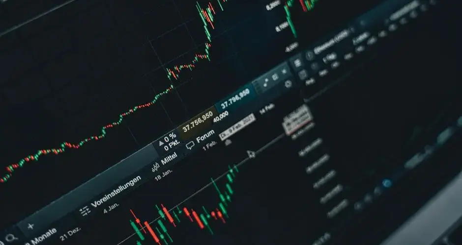
A tick chart is a price chart that closes a new bar after a fixed number of transactions, or "ticks," rather than after a fixed unit of time. Because trade counts speed up and slow down with real trading activity, tick charts produce bars quickly during busy periods and slowly during quiet ones, unlike a time-based chart, which always closes on schedule regardless of how much trading actually happened.
Key Takeaways
- A tick chart forms a new bar after a set number of trades (e.g., every 500 ticks), not after a set amount of time.
- Bar frequency scales with market activity: many bars form quickly during heavy volume, few form during quiet stretches.
- Tick charts are activity-based, in the same family as range bars, volume bars, and renko charts, all contrast with standard time-based charts.
- A "tick" in this context means one recorded trade/print, not the bid-ask tick used elsewhere in market-data terminology.
- Lower tick counts produce more granular, noisier bars; higher tick counts produce smoother, less frequent bars.
- Tick charts differ from range bars: ticks count transactions, range bars count price movement, regardless of how many trades produced it.
- Tick counts are not standardized across instruments, the right setting depends on that instrument's typical trade frequency.
- Because trade counts vary by data feed and consolidation method, the same tick-count setting can look different across brokers or platforms.
How a Tick Chart Works
Every executed trade that prints to the tape counts as one tick. A tick chart is configured with a fixed tick count, for example, 250, 500, or 1,000, and a new bar opens as soon as the prior bar has recorded that many trades. The bar's open, high, low, and close are built from the prices of the trades that occurred during that count, exactly like a time-based candle, except the "clock" driving each bar's completion is transaction count instead of elapsed minutes.
The practical effect is that a tick chart's timeline stretches and compresses with market activity. During a fast-moving, high-volume session, a 500-tick bar might complete in a matter of seconds. During a thin, low-volume period, such as overnight hours in a stock, or a quiet stretch in a less-traded contract, that same 500-tick bar might take many minutes to close. A time-based chart set to a fixed interval, by contrast, always produces exactly one bar per interval no matter how much or how little trading occurred within it.
Tick Charts vs. Range Bars vs. Time-Based Charts
Tick charts belong to a broader family of activity-based (sometimes called "event-based") chart types that build bars from market activity rather than from the calendar. The most closely related alternative is the range bar:
- Tick chart, a new bar closes after a fixed number of trades (transactions), regardless of how far price moved during those trades.
- Range bar, a new bar closes once price moves a fixed number of points or ticks (in the price-increment sense), regardless of how many individual trades it took to get there.
- Time-based chart (e.g., 1-minute, 5-minute), a new bar closes after a fixed span of clock time, regardless of trading activity or price movement during that span.
Both tick charts and range bars are attempts to normalize a chart around real market activity instead of the clock, but they normalize around different things: a tick chart normalizes around transaction count, while a range bar normalizes around price displacement. A very high-volume instrument with many small trades can generate tick bars quickly even while price barely moves, whereas a range bar under the same conditions would stay open until price actually traveled the specified distance.
Worked Example (Hypothetical)
Consider a hypothetical stock configured on a 500-tick chart. In the hypothetical scenario, during the first ten minutes after the open, the stock prints roughly 1,500 trades as buyers and sellers actively transact, enough to complete three full 500-tick bars in that short window. Later in the same hypothetical session, trading activity thins out during a midday lull, and the stock takes 45 minutes to accumulate the next 500 trades, so a single bar spans that entire 45-minute stretch. On a standard 10-minute time-based chart, both periods would instead be sliced into equal, fixed-length bars, one bar per 10 minutes throughout, busy or quiet, obscuring the difference in actual trading intensity that the tick chart makes visible.
Why Tick Charts Matter
Some short-term and intraday traders use tick charts because they believe the chart should reflect how much the market is actually "doing," not how much clock time has passed. In this view, a burst of rapid trading carries more information than an equivalent span of quiet time, and a tick chart's bar-by-bar rhythm reflects that directly, more bars form when participation is high, fewer when it's low. This can make patterns like exhaustion, rapid absorption of orders, or a sudden surge of participants more visually apparent than they would be on a fixed-interval chart that treats every minute as equally significant.
Tick charts are most commonly discussed in the context of very short-term, order-flow-oriented trading on liquid futures, index, and high-volume equity instruments, where trade counts are high enough to produce a meaningful stream of bars within a session. They are a stylistic and methodological choice rather than a technique with a proven predictive edge over time-based charting, the same price data underlies both, just organized differently.
Limitations and Common Mistakes
- Assuming tick counts are standardized. A "500-tick" setting is not a universal unit, different data feeds and brokers may consolidate trades differently, so the same setting can produce visibly different bars across platforms.
- Confusing "tick" with the bid-ask tick. In tick-chart terminology a tick is one recorded transaction, a different meaning from "uptick/downtick" used elsewhere in market-structure discussion.
- Applying a tick count to a low-volume instrument. On thinly traded names, tick bars can take a very long time to complete, effectively behaving like an irregular, hard-to-interpret time-based chart.
- Treating tick charts as inherently predictive. Reorganizing the same price data around trade count rather than time does not itself generate a trading edge; the underlying data is identical.
- Ignoring cross-session comparability. Because bar count per session varies with volume, comparing tick-chart pattern counts across days with very different activity levels can be misleading.
- Picking a tick count without testing it. A setting borrowed from a different instrument or timeframe may produce bars that are far too granular or far too coarse for the intended use.
Rebasing the Axis Does Not Add Information
A tick chart reorganises the same trades around transaction count instead of the clock. That changes where the bar boundaries fall, and it introduces nothing that was not already in the data. Any impression that the chart looks cleaner or that patterns appear more reliable comes from the resampling, not from new evidence, and it is worth holding that firmly before concluding the format itself provides an edge.
What it genuinely does is make bar frequency track activity. During a busy stretch bars complete quickly and the chart is dense; during a quiet stretch a single bar can take a long time. That behaviour is the reason to use it, and it is also the reason it degrades on thinly traded instruments, where bars can take so long to fill that the chart becomes an irregular time chart with no fixed interval.
Two definitional traps. A tick here means one recorded trade, which is a different thing from the uptick and downtick vocabulary used elsewhere in market-structure discussion. And a 500-tick setting is not a portable unit, since data feeds consolidate trades differently and the same number can produce visibly different bars on two platforms.
It also differs from a range bar in what it counts. Ticks count transactions regardless of how far price moved; range bars count price movement regardless of how many trades produced it. Those are separate questions, and treating the two chart families as interchangeable activity charts blurs a distinction that decides what each one is showing.
Frequently Asked Questions
What is a tick chart?
A tick chart is a price chart that forms a new bar or candle after a fixed number of transactions (ticks) have occurred, rather than after a fixed amount of time. During periods of heavy trading activity, tick charts produce bars quickly; during quiet periods, a single bar can take much longer to complete.
What is the difference between a tick chart and a time-based chart?
A time-based chart (such as a 5-minute chart) always closes a bar after a fixed interval of time regardless of how much trading occurred. A tick chart closes a bar after a fixed number of trades regardless of how much time that took, so its bar frequency speeds up and slows down with actual market activity.
What is the difference between a tick chart and a range bar chart?
A tick chart forms a new bar based on the number of trades that occur, while a range bar chart forms a new bar once price moves a fixed number of points or ticks, regardless of how many individual trades that took. Both are activity-based rather than time-based, but they measure different things: transaction count versus price movement.
What tick count should I use for a tick chart?
There is no universally correct tick count; it depends on the instrument's typical trading volume and the trader's timeframe of interest. Lower tick counts (such as 100 or 250 ticks) produce more, noisier bars suited to very short-term trading, while higher tick counts (such as 1,000 or more) produce fewer, smoother bars closer in feel to a short time-based chart. Traders typically test several settings against the specific instrument they trade.
Why do some traders prefer tick charts over time-based charts?
Some traders believe tick charts better reflect actual market participation because they compress activity during fast, high-volume periods and stretch out during slow periods, whereas a time-based chart treats a quiet minute and a frantic minute as visually identical. This is a stylistic and methodological preference, not a proven predictive advantage.
Does one tick mean one trade or one price change?
It depends on the platform, and the two definitions produce different charts from the same feed. Counting transactions means a bar completes after a fixed number of prints regardless of whether price moved. Counting price changes means quiet periods with repeated trades at the same price advance the count slowly or not at all. The definition is rarely displayed on the chart, so it is worth confirming in the platform documentation.
How do block trades and odd lots affect a tick chart?
Under the transaction-counting definition each print advances the count by one regardless of its size, so a single share and a very large block contribute equally. That means a tick chart in a market with many small automated prints completes bars quickly even when little size has changed hands. It is a count of events rather than a measure of activity, which is the opposite of what a constant-volume chart does.
Is a tick count comparable across different instruments?
No. A count that produces a readable chart on a heavily traded contract completes far too quickly there and far too slowly on a thin one, because trade frequency differs by orders of magnitude across instruments. The setting has to be chosen per instrument, and a tick chart is therefore not directly comparable to another instrument tick chart even at the same setting.
What data is needed to build a tick chart, and how far back can it go?
Full trade-level data, since every print has to be counted. That is substantially larger than bar data and is priced accordingly, so vendor coverage typically extends back a limited number of years and gets patchier the further back it goes. A tick chart cannot be reconstructed from daily or minute bars, which places a hard limit on how much history is available for any study using them.
References
Disclaimer
This page is for educational purposes only and does not constitute investment, financial, or trading advice. Chart types, including tick charts, are ways of organizing historical price data and do not guarantee future results. Any example on this page uses illustrative, hypothetical data, not live or historical market data. Swoopr Investment is not a licensed investment advisor; consult a qualified professional before making investment decisions.