
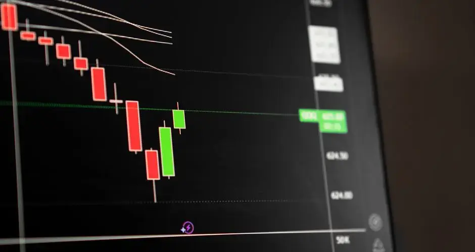
Direct Answer
Reading a price chart means working through a fixed order, timeframe, trend direction, market structure, and volume, before layering on any indicator. The same security can be trending on a daily chart while ranging on an hourly chart, so a chart-reading process has to specify which timeframe governs the decision before an indicator is added.
The Practical Goal of Reading a Chart
The same security can trend on one timeframe and range on another.
The practical objective of chart reading is not to memorize candlestick names or indicator formulas. It is to build a repeatable process, timeframe, trend, structure, and volume first, then at most a couple of indicators, that turns a chart into a documented decision with a clear invalidation point, rather than a running commentary on whatever the price just did.
Key Takeaways
- Pick the market and the timeframe before you open a chart. The same price series produces contradictory readings at different intervals, and the resolution is to choose the one matching your holding period, not to reconcile them.
- Chart type changes what you can see. A line chart hides the range within each period; a candlestick shows it. Neither is more correct, but they support different questions.
- Trend is a description of structure, higher highs and higher lows or the reverse, and reading it does not require an indicator.
- Mark support and resistance as zones. Prior transaction clusters are not precise to the cent, and treating them as exact lines produces stops that get hit by noise.
- Volume is the confirming variable. A move on low participation and the same move on heavy participation carry different information about whether it will hold.
- Indicators repeat the price data in a different shape. Adding a second indicator from the same family adds visual complexity without adding evidence.
- A setup is only complete when entry, invalidation and size are all defined, because those three together are what determine the loss you actually take when it fails.
Choose the Market and Timeframe
The same security can trend on one timeframe and range on another.
Intraday charts (1-minute to 15-minute) show short-term noise and momentum relevant to a same-day trade. Daily charts show the primary trend most swing traders rely on. Weekly and monthly charts filter out short-term noise and reveal the multi-year trend a long-term investor cares about. A stock can look like a strong uptrend on a weekly chart while chopping sideways on a 15-minute chart, so the first decision is not what the chart shows but which timeframe actually matches the decision being made.
Practical checklist
- Match the chart timeframe to the actual holding period being considered.
- Note whether the higher-timeframe trend agrees or conflicts with the lower-timeframe view.
- Confirm the exchange, ticker, and adjusted vs. unadjusted price series being displayed.
- Check that the chart includes enough history to show the current trend or range.
- Record which timeframe was used before drawing any conclusion.
Common mistake
The common mistake is timeframe shopping: switching between timeframes until one happens to support a view already held, rather than picking the timeframe that matches the trade or investment horizon in advance.
Understand Chart Types
Line, bar, and candlestick charts display different levels of price detail.
A line chart connects closing prices and is the simplest way to see overall direction, but it hides intraday range entirely. A bar chart (OHLC) adds small tick marks showing the open and the high/low/close of each period. A candlestick chart plots the same open-high-low-close data as a bar chart but fills a colored body between the open and close, making it faster to see at a glance whether a period closed up or down and how that close compares to the period's full range.
Practical checklist
- Confirm which chart type is displayed before interpreting shape or color.
- Use candlesticks when the open/close relationship and wick length matter to the decision.
- Use a line chart when comparing overall trend across several securities at once.
- Verify the color convention (which color represents an up period vs. a down period) on the specific platform.
- Check whether the chart is adjusted for splits and dividends before comparing historical prices.
Common mistake
The common mistake is reading meaning into a single candlestick's shape without checking where it sits relative to the recent trend, nearby support/resistance, and volume.
Read Trend and Structure
Identify higher highs, higher lows, lower highs, lower lows, and range boundaries.
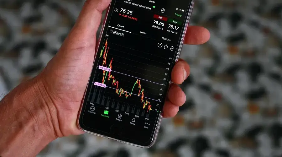
An uptrend is typically defined as a sequence of higher highs and higher lows; a downtrend is the reverse pattern of lower highs and lower lows. When price stops making new highs or lows and instead oscillates between a defined ceiling and floor, the market is described as ranging rather than trending. Structure is read by marking the most recent significant swing points, not every minor wiggle, since not every small pivot represents a meaningful change in direction.
Practical checklist
- Mark the most recent three to five significant swing highs and lows, not minor noise.
- Confirm whether the current sequence of swings still fits the uptrend, downtrend, or range definition.
- Note the specific point where the trend would be considered broken (for example, a lower low forming in an uptrend).
- Check structure on a higher timeframe before trusting a lower-timeframe reading.
- Distinguish a genuine range from a brief pause inside an ongoing trend.
Common mistake
The common mistake is labeling a normal pullback within an established trend as a full reversal after only one or two counter-trend candles.
Mark Support and Resistance
Use prior reactions, congestion, gaps, and high-volume areas as contextual zones.
Support and resistance are best treated as zones rather than exact prices, areas where price has previously reversed, stalled, or traded heavily. A level tends to carry more weight the more times it has been tested and the more volume traded near it, but a broken support level often becomes resistance on a later retest, and the reverse holds too. That flip is one reason these areas are marked as approximate ranges rather than single precise lines.
Practical checklist
- Draw zones around clusters of prior highs or lows rather than a single exact price.
- Note how many times a level has been tested and whether reactions there were shrinking or growing.
- Check whether a broken level has since been retested from the other side.
- Cross-check levels across at least two timeframes for confluence.
- Avoid drawing a zone so tight that ordinary volatility triggers a false break.
Common mistake
The common mistake is treating a support or resistance line as an exact price that must hold or fail precisely, rather than as an approximate zone where a reaction becomes more likely.
Evaluate Volume
Compare current volume with normal activity and the type of move occurring.
Volume measures how many shares or contracts changed hands in a period and is generally read alongside price rather than on its own. A price move on volume well above the recent average is typically considered more significant than the same move on light volume, since higher volume suggests broader participation rather than a thin move that can reverse easily. Volume tends to expand on genuine breakouts and often, though not always, contracts during quiet consolidation.
Practical checklist
- Compare the current period's volume to a recent average, not to an arbitrary round number.
- Note whether a breakout or breakdown is accompanied by above-average volume.
- Watch for volume that stays low during an apparent trend, which weakens confidence in the move.
- Check for volume spikes tied to news or earnings before drawing conclusions from them.
- Treat volume as confirming or weakening a price signal, not as a standalone signal.
Common mistake
The common mistake is assuming any volume spike is automatically bullish or bearish without checking whether price closed up or down on that volume and where it occurred relative to structure.
Add Indicators Carefully
Use one or two tools that answer specific questions rather than stacking redundant signals.
Indicators such as moving averages, RSI, or MACD are calculations derived from price and/or volume, and most fall into a small number of families, trend-following, momentum, and volatility, that overlap heavily with each other. Adding several indicators from the same family, such as two different momentum oscillators, mostly restates the same underlying information in a different shape rather than adding independent evidence.

Practical checklist
- Choose indicators from different families, such as one trend tool and one momentum tool, rather than duplicates.
- Know the calculation and settings behind each indicator before relying on it.
- Confirm whether the indicator lags price, which most do, before treating its signal as predictive.
- Remove any indicator that doesn't change a specific, pre-defined decision.
- Check how an indicator would have behaved on past chart data before using it live.
Common mistake
The common mistake is stacking many indicators on one chart until at least one appears to confirm the desired conclusion, rather than choosing indicators in advance based on the question they're meant to answer.
Define the Setup
Write the condition, trigger, invalidation, target logic, and time limit.
A setup is the specific, written combination of chart conditions that must be present before considering an action, for example, price above a moving average, a pullback into a support zone, and volume confirming the bounce. Writing the setup down before the trigger occurs, rather than describing it in hindsight, is what makes it possible to test the setup's track record and to recognize objectively when the trigger isn't actually present.
Practical checklist
- Write the exact condition or conditions that must be true for the setup to be valid.
- Define the specific trigger that starts the position, not just a general impression.
- Set the invalidation level or condition before entering, not after.
- Define what a completed target or exit looks like in advance.
- Set a time limit or review point for setups that haven't played out.
Common mistake
The common mistake is describing a chart pattern as a valid setup only after the outcome is already known, which makes the setup impossible to test or repeat going forward.
Check Liquidity and Events
Review spread, average volume, earnings, news, and market conditions before acting.
A chart pattern that looks clean can still be difficult to trade if the security has a wide bid-ask spread or thin average volume, since both increase the cost and uncertainty of getting in or out near the expected price. Scheduled events such as earnings releases, economic data, and options expiration can also override normal chart behavior by causing gaps or volatility that has little to do with the technical pattern itself.
Practical checklist
- Check the average daily volume and typical bid-ask spread for the security.
- Confirm no earnings release or major scheduled event falls inside the expected holding period.
- Note any halted, illiquid, or unusually thin trading conditions before acting.
- Check broader market conditions, such as the index trend, alongside the individual chart.
- Size the position to account for wider slippage in less liquid names.
Common mistake
The common mistake is applying a chart pattern learned on a liquid, heavily traded security to a thin, illiquid one without adjusting for wider spreads and less reliable fills.
Record the Result
Save the chart and note whether the rule was followed, not only whether the trade won.
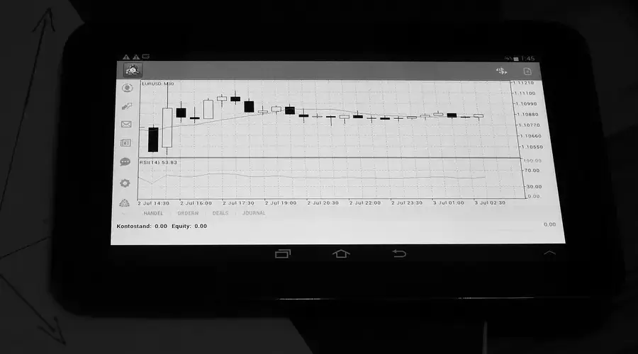
A trading journal that only records profit and loss misses the more useful information: whether the setup criteria were actually met, whether the trigger and invalidation rules were followed, and whether the outcome came from the process or from an exception to it. Saving an annotated chart alongside the outcome makes it possible to review, months later, whether a pattern that looked reliable actually held up across repeated instances rather than one favorable case.
Practical checklist
- Save a chart screenshot marked with the setup, trigger, and invalidation used.
- Record whether the pre-defined rules were followed exactly, or where they were broken.
- Note the outcome separately from whether the process was followed correctly.
- Review a batch of saved setups periodically rather than judging from a single result.
- Track which specific setup or pattern each entry belongs to for later comparison.
Common mistake
The common mistake is reviewing only winning trades for patterns to repeat, while skipping the review of losing trades that followed the same rules just as correctly.
Worked Decision Example
Hypothetical example, for education only.
This page argues that support is a zone rather than a line. Here is what that distinction is actually worth, using a hypothetical daily chart where three swing lows cluster over eight weeks.
| Reading | Value |
|---|---|
| Swing lows forming the zone | $61.80, $62.10, $61.95 |
| Support zone | $61.80 to $62.10, a band 30 cents wide |
| Current price on the retest | $62.35 |
| Assumed slippage on the exit | $0.05 per share |
| Maximum planned loss | $200 |
Treat the zone as a line and place the stop at $62.10. Risk per share is $62.35 - $62.10 + $0.05 = $0.30, so $200 / $0.30 allows 666 shares, a position worth about $41,525. The stop sits inside the band where the last three lows printed, which is precisely where the next wick is most likely to reach.
Treat the zone as a zone and place the stop at $61.75, just under its floor. Risk per share is $62.35 - $61.75 + $0.05 = $0.65, so $200 / $0.65 allows 307 shares, a position worth about $19,141.
Same chart, same thesis, same maximum loss. The tighter stop more than doubles the share count and commits more than twice the capital, which means an overnight gap through the zone costs far more than the $200 that was planned. It also converts routine noise inside the zone into a stop-out, so the position is exited on a move the thesis explicitly allows for.
The wider stop is not automatically better. It is a smaller position with a lower probability of being closed by noise, which is a different trade with different mathematics. The point is that the choice between them is made when you decide whether support is a price or a band, and most traders make that choice without noticing they made it.
Misconceptions vs. Reality
| Misconception | Reality |
|---|---|
| A single candlestick pattern reliably predicts the next move | A candlestick's meaning depends heavily on the surrounding trend, volume, and where it forms relative to support and resistance |
| More indicators on a chart produce a more reliable signal | Indicators from the same family mostly repeat the same underlying price and volume data in a different shape |
| A broken support level is gone for good | A former support level frequently acts as resistance on a later retest, and the reverse is just as common |
| Higher timeframes are only useful for long-term investors | Checking a higher timeframe's trend is standard practice even for short-term traders, since it provides context a lower timeframe can't show |
| Volume only matters for large institutional trades | Volume is one of the simplest ways to gauge whether a price move has broad participation or is likely to reverse quickly |
Risks, Limitations, and Exceptions
- Chart patterns are probabilistic tendencies, not guarantees, and can fail without warning.
- Thin or illiquid securities can produce chart patterns that don't hold up once real order flow is applied.
- Gaps, halts, and after-hours moves can invalidate a setup before the market even opens.
- Indicator settings that perform well in a trending market often perform poorly in a ranging one, and vice versa.
- Different charting platforms can calculate the same indicator slightly differently, producing different readings.
- A pattern that looks clean on a completed chart may have looked ambiguous while it was still forming in real time.
- Chart reading alone does not account for company fundamentals, sector conditions, or macro events that can override technical levels.
- Historical indicator or pattern performance does not guarantee similar results going forward.
Practical Implementation Checklist
- Pick one security and one timeframe that matches a realistic trading or investing horizon.
- Identify the chart type being used and confirm the color and format conventions.
- Mark the recent swing highs and lows to establish trend or range structure.
- Draw approximate support and resistance zones around clusters of prior reactions.
- Check volume on recent significant moves for confirmation or divergence.
- Add no more than one or two indicators, chosen to answer a specific question.
- Write a setup definition with condition, trigger, invalidation, and target before watching the chart live.
- Check liquidity, spread, and any upcoming scheduled events for the security.
- Practice the setup on historical charts, or paper-trade it, before using real capital.
- Save annotated charts and review outcomes against the written rules regularly.
Conclusion
The same security can trend on one timeframe and range on another.
To read price movement without relying on indicators, continue to price action trading.
Technical Analysis Basics FAQs
What should a beginner understand about technical analysis for beginners?
Start with timeframe and trend before anything else, a chart only makes sense once you know whether you're looking at an intraday, daily, or weekly view, and whether the security is trending or ranging on that view. Learn to read one chart type well, usually candlesticks, before adding indicators.
What are the largest risks in technical analysis for beginners?
The biggest risks are overfitting a story to a single chart, ignoring liquidity and spread on thinly traded securities, and treating indicator signals as guarantees rather than probabilistic inputs. Scheduled events like earnings can also override a clean-looking pattern overnight.
Which inputs matter most for technical analysis for beginners?
Timeframe, recent swing structure (trend versus range), support and resistance zones, and volume matter most. Indicators are a smaller, later addition, useful only once the basic structure and volume picture are understood.
How often should technical analysis for beginners be reviewed?
Chart-based setups should be reviewed as often as the trading timeframe requires: intraday setups need checking within the session, while swing or position setups are typically reviewed daily or weekly. The broader approach and indicator choices are worth revisiting after moving between trending and ranging market conditions.
Which Swoopr Investment tool supports technical analysis for beginners?
A guided chart-annotation tool, described above, can help a reader mark structure, check a setup against pre-defined rules, and log the outcome for later review, rather than relying on memory or after-the-fact rationalization.
What is the minimum a chart needs to show to be useful?
A price series and a time axis. Everything else, including the bar type, the indicators, the drawing tools and the colour scheme, is an addition that summarises or transforms what is already there. Starting from that minimum makes it easier to notice when a chart element is contributing something and when it is decorating a conclusion already reached from price.
Should a beginner follow one instrument or several?
Following one closely teaches how that instrument behaves: how wide its typical range is, when it is active, how it responds to its own news. Those characteristics differ enough between instruments that a rule calibrated on one is not calibrated on another. Breadth is useful later, for comparison, and it is difficult to interpret before there is a reference point to compare against.
What is the difference between chart reading and technical analysis?
Chart reading is the visual practice: identifying structure, levels and patterns by eye. Technical analysis is the broader field, which also includes defining rules precisely enough to compute, testing them against history, and reasoning about what the data can and cannot support. Someone can be fluent at the first and never engage with the second, and the two attract different failure modes.
Does technical analysis rest on any assumption about markets?
One in particular: that the record of past prices and volumes contains information relevant to future prices. That is a substantive claim, it is contested by the stronger forms of the efficient markets argument, and it is testable in principle. Practitioners are not obliged to defend it in every conversation, and it is worth knowing that it is a premise rather than a fact.